
Ever stared at a chart in a sprint review and thought, “That’s a nice downward line, what am I actually looking at?” You’re probably looking at a burndown chart. It’s one of those Agile tools that seems almost too simple, but don’t be fooled. When used properly, it can say a lot about how your team’s doing.
Are you making steady progress? Hitting blockers? Flying ahead of schedule? The burndown chart gives you a snapshot, without the waffle. But let’s not stop at the basics. What actually goes into a burndown chart, and how can you read it without guessing? And more importantly, are you using the right one for your team? Let’s break it down properly.
What is a Burndown Chart?
A burndown chart is basically a graph that helps Agile teams keep track of how much work they’ve got left and how quickly it’s getting done. Sounds straightforward, right? That’s because it is. But don’t mistake simple for useless, this chart can tell you a lot at a glance.
Picture this, on day one of a sprint, you’ve got a pile of work. Let’s say 100 story points worth. You plot that as your starting point at the top of the chart. Now, each day as the team knocks tasks off the list, the chart gets updated to reflect the work left. By the end of the sprint, if everything goes to plan, the line should slope neatly down to zero.
But here’s where it gets interesting. That slope doesn’t always behave the way you expect. Maybe the line plateaus because the team hit a blocker. Maybe it drops steeply because someone managed to blitz through a few big tasks. That shape tells a story. And that story helps the team make better decisions.
It’s not just about the pretty line trending down. It’s a conversation starter. Why are we ahead? Why are we behind? Is our estimation accurate? Do we need to adjust our approach? It’s these questions that make the burndown chart more than just admin, it’s a tool for insight.
You’ll often see a second line on the chart too, that’s the ideal burn. That’s what it looks like if everything goes perfectly. Real life rarely does, but comparing the actual to the ideal helps teams figure out where they stand and what they might need to change. Handy, right?
Would your team benefit from using one? Probably. But only if you're actually going to use it, not just update it and forget about it.
Components of a Burndown Chart
Ever found yourself staring at a burndown chart, wondering what all those lines and axes mean? Let's break it down together.
Time (X-Axis)
Think of the horizontal axis as your project's timeline. It could represent days, weeks, or sprints, depending on your project's structure. This axis helps you track progress over time.
Work Remaining (Y-Axis)
The vertical axis shows the amount of work left to do. This could be measured in story points, hours, or tasks. It's your visual cue for how much is still on your plate.
Start Point
This is where your journey begins. It marks the total amount of work planned at the project's outset. It's the top-left point on your chart.
Finish Point
The goalpost. This point indicates when you expect all tasks to be completed. It's typically at the bottom-right, showing zero work remaining.
Ideal Work Line
Imagine a straight line connecting the start and finish points. This line represents the perfect scenario where work is completed at a consistent pace. It's your benchmark for progress.
Actual Work Line
This line tells the real story. It tracks the actual amount of work remaining at each point in time. Comparing this line to the ideal one shows whether you're ahead, on track, or falling behind.
Progress Indicators
If your actual work line dips below the ideal, you're ahead of schedule. If it's above, you might need to pick up the pace. These indicators help you adjust your strategy in real-time.
Scope Changes
Sometimes, new tasks are added mid-project. These changes can cause the actual work line to rise, indicating an increase in workload. It's essential to account for these shifts to maintain accurate tracking.
Why It Matters
Understanding these components isn't just about reading a chart; it's about gaining insights into your project's health. By monitoring these elements, you can make informed decisions, adjust plans proactively, and keep your team aligned.
How to Read a Burndown Chart
Not sure what all those jagged lines on your burndown chart actually mean? Let’s break it down so you can start spotting red flags, and green lights without needing a magnifying glass.
Interpreting the Chart
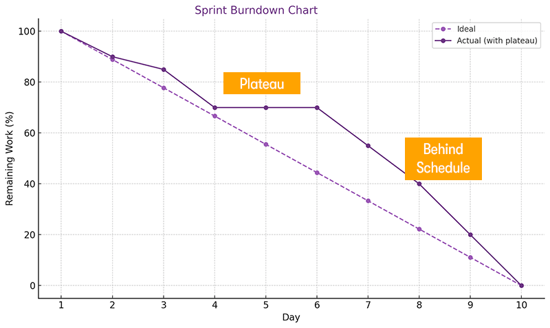
Actual Line Above Ideal Line: Indicates that the team is behind schedule, with more work remaining than planned.
Actual Line Below Ideal Line: Suggests the team is ahead of schedule, having completed more work than expected.
Flat Line: A horizontal line implies no work has been completed during that period, possibly due to blockers or delays.
Sudden Drops: Sharp declines in the actual work line may indicate bulk completion of tasks or late updates to the tracking system.
Common Patterns and What They Mean
Consistent Decline: A steady downward trend in the actual work line suggests balanced progress and effective sprint planning.
Erratic Fluctuations: Frequent ups and downs may point to inconsistent work practices or scope changes during the sprint.
Plateaus: Extended periods without progress could signal impediments that need addressing.
Practical Tips for Using Burndown Charts
Regular Updates: Ensure the chart is updated daily to reflect accurate progress.
Team Involvement: Encourage the team to engage with the chart, fostering accountability and transparency.
Analyse Trends: Use the chart to identify patterns, adjust workflows, and improve future sprint planning
Types of Burndown Chart
There are different types of burndown charts, each serving a unique purpose, let’s break them down.
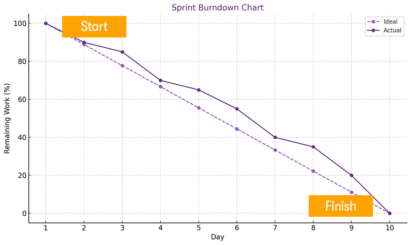
Sprint Burndown Chart
This is the one most teams start with. It tracks work within a single sprint, typically 1 to 4 weeks long. The vertical axis shows the amount of work (like story points or tasks), and the horizontal axis represents time.
Each day, you update the chart to reflect how much work remains. Ideally, the line trends downward, hitting zero by the sprint’s end. If it’s flat or rising, that’s a red flag.
Why use it? To keep the team focused and identify issues early.
Release Burndown Chart
A release burndown chart tracks progress across multiple sprints leading up to a product release. It helps you see if you’re on track to deliver all planned features by the release date.
Why use it? To provide stakeholders with a high-level view of progress and adjust plans as needed.
Product Burndown Chart
This one zooms out even further. It tracks the entire product backlog over time, giving insight into long-term progress and trends.
Why use it? To monitor overall product development and make strategic decisions.
Epic Burndown Chart
Working on a large feature or initiative? An epic burndown chart tracks progress on that specific body of work, often spanning multiple sprints.
Why use it? To focus on the completion of significant features and ensure they’re progressing as planned.
Subtask Burndown Chart
For teams that break stories into subtasks, this chart tracks the completion of those smaller pieces within a sprint.
Why use it? To get a granular view of progress and identify bottlenecks at the task level.
Not sure which one to use? Consider your goals. Each chart offers a different lens. Sometimes, using multiple charts provides the most comprehensive view.
Who Uses a Burndown Chart?
Burndown charts are a staple in Agile and Scrum environments, offering a visual snapshot of work remaining over time. But who exactly uses them, and how do they fit into the daily rhythm of a team?
Development Team
The development team is at the heart of burndown chart usage. They update it regularly, often daily, to reflect the work completed and what's left. This practice helps them monitor their progress and adjust their efforts to stay on track. It's a tool that supports self-organisation and accountability within the team.
Scrum Master
The Scrum Master plays a supportive role in the use of burndown charts. They ensure that the chart is maintained and accurately reflects the team's progress. By facilitating discussions around the chart during daily stand-ups, the Scrum Master helps the team identify any impediments and fosters a culture of continuous improvement.
Product Owner
For the Product Owner, the burndown chart is a planning tool. It provides insights into the team's progress toward the sprint goal, allowing for informed decisions about backlog prioritisation and release planning. While they don't update the chart themselves, the information it provides is crucial for aligning the product roadmap with the team's capacity.
Stakeholders
Stakeholders, including clients and upper management, use burndown charts to gain visibility into the project's progress. The chart offers a transparent view of how the team is performing against the sprint goals, fostering trust and facilitating communication between the development team and external parties.
Project Managers
Project Managers utilise burndown charts to monitor the overall health of the project. By analysing trends and deviations in the chart, they can identify risks early and take corrective actions to keep the project on schedule. It's a strategic tool that aids in resource allocation and timeline adjustments.
Burndown Chart Limitations
Burndown charts are a staple in Agile project management, offering a visual snapshot of work remaining over time. While they can be helpful, it's crucial to understand their limitations to avoid potential pitfalls.
Oversimplification of Progress
Burndown charts track the amount of work left but don't provide context about the nature of that work. They don't differentiate between tasks of varying complexity or importance, potentially leading to a misleading sense of progress. For instance, completing several minor tasks may show significant progress on the chart, even if major, critical tasks remain unaddressed.
Inaccuracy Due to Poor Estimations
The effectiveness of a burndown chart heavily relies on the accuracy of initial time or effort estimates. If these estimates are off, the chart can misrepresent the team's actual progress. Overestimations may suggest the team is ahead of schedule, while underestimations can indicate delays, even if the team's performance is consistent.
Lack of Insight into Work Quality
Burndown charts focus on quantity (how much work remains) and not quality. They don't reflect whether the completed work meets the required standards or if it's riddled with issues. This absence of quality metrics can lead teams to prioritise speed over excellence, potentially compromising the final product.
Inability to Reflect Scope Changes
Projects often evolve, with new tasks added or existing ones modified. Burndown charts don't inherently account for these changes, which can distort the representation of progress. Without adjustments, the chart may suggest the team is falling behind when in reality the scope has simply expanded.
Potential to Mislead Stakeholders
Stakeholders may interpret burndown charts as indicators of project health. However, these charts don't provide insights into task dependencies, resource constraints, or unforeseen challenges. Relying solely on burndown charts can lead to misunderstandings about the project's true status.
Encouragement of Unhealthy Work Practices
The pressure to maintain a steady downward trajectory on the chart can lead teams to adopt counterproductive behaviours. They might rush tasks, skip necessary testing, or avoid taking on complex but essential work, all to keep the chart looking favourable.
Not Suitable for All Project Types
Burndown charts are most effective for projects with clearly defined tasks and timelines. In more exploratory or research based projects where tasks are less predictable, these charts can be less applicable and potentially misleading.
Risk of Misinterpretation
Without proper training, team members and stakeholders might misread the chart's data. For example, a plateau in the chart could be due to various reasons like awaiting feedback, encountering a complex problem, or even a data entry oversight. Misinterpretations can lead to unnecessary concern or misplaced blame.
Dependence on Regular Updates
For a burndown chart to be effective, it requires consistent and accurate updates. Neglecting to update the chart can render it useless or worse, provide a false sense of security about the project's progress.
Limited Predictive Power
While burndown charts can show trends, they aren't predictive tools. They don't account for potential future risks or changes, limiting their usefulness in forecasting project outcomes.
Conclusion
Still think burndown charts are just pretty graphs? They’re sharper than they look. One last tip, try colour-coding scope creep. It’s easier to track when you can see the difference, not just feel it. And ever tried flipping the Y-axis so zero sits at the top? Some teams find it helps them visualise ‘burning down’ more intuitively.
Also, don't ignore public display, stick the chart where everyone can see it. It keeps the team honest. Even if your have distributed team, use a shared digital whiteboard to mimic the office vibe. Now you’re not just tracking work, you’re making the chart work for you.